Short answer: a menu that sells is easy to read in a minute, runs in the order people eat, puts the dish you most want to sell first in each section, describes every dish in a few true words, and shows prices (including VAT) without a column to shop down. Diners read menus top to bottom like a book — so the order you list things in matters more than any "sweet spot".
This guide is for owners of UK restaurants, cafés and pubs who are designing a menu from scratch or redesigning one that has grown messy. No design software required.
What makes a good restaurant menu?
A good menu helps a guest choose quickly and helps you sell the dishes you want to sell. Everything else — fonts, paper, colours — serves those two jobs.
Illustration · one page, six decisions
What a menu that sells has on it
To start 1
Ham hock terrine 8.50
piccalilli, toasted sourdough
Soup of the day 6.95
with warm bread
Mains 2
Braised beef shin 19.50
mash, roasted roots, red wine gravy
Beer-battered haddock 16.95
chips, crushed peas, tartare
Add chips or onion rings 4.50 3
All prices include VAT 4
Allergies? Ask us — full allergen information is available 5
An optional 12.5% service charge is added to tables of 6+ 6
- 1Sections in the order people eat
- 2The dish you most want to sell, first in its section
- 3Add-ons printed, with a price
- 4Prices include VAT; no £ column to scan
- 5Allergen line on every menu
- 6Any service charge, as clear as the prices
Five checks before you think about looks:
- Can a first-time guest find what they want in under a minute?
- Does it run in the order people eat — starters or small plates, mains, sides, desserts, drinks?
- Is the dish you most want to sell first in its section, and set apart (a box, a tint or a "chef's choice" line — just one or two per page)?
- Does every dish have a short, true description that answers "what is it?"
- Does it show everything the law requires — prices including VAT, any service charge, allergen information? (There is a checklist further down.)
Where do people look first on a menu?
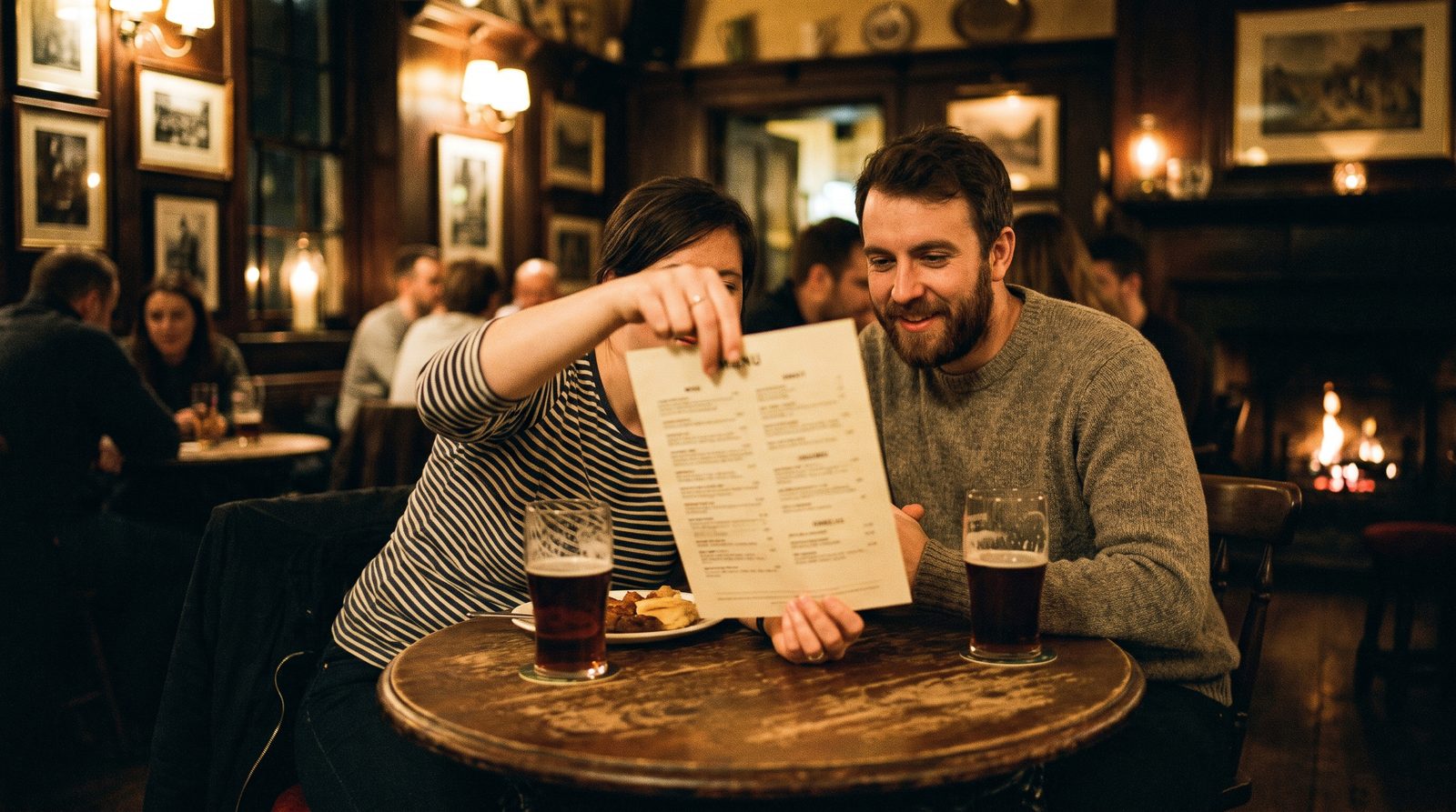
At the top, then down — the way they read anything else. For decades menu guides have repeated the "golden triangle": that eyes land in the middle of the page, jump to the top right, then the top left, so your most profitable dishes belong there. Most of the guides ranking on Google for menu design still say so.
The research does not back it. In an eye-tracking study published in the International Journal of Hospitality Management, Sybil Yang tracked where diners' eyes went as they read restaurant menus. They read sequentially, like a book, and the study found no evidence of a menu "sweet spot".
What the research found
Diners read a menu like a book — top to bottom, section by section
What many guides claim
Middle → top right → top left
What eye-tracking found
Left column down, then the right column
What that means in practice:
- Order matters more than position. The first dish in each section and the first section on the page get read by everyone. Put the dish you most want to sell there.
- Don't bury things at the bottom. Sides, add-ons and desserts listed last are the easiest to skip. Print add-ons next to the dishes they go with.
- Make it easy to read in order. Clear section headings, generous space between sections, and no text running across folds or around photos.
How should I lay out my menu?
Follow the meal: whatever people order first goes first, and each section starts with its strongest dish. Then decide how many pages you really need.
| Venue | Format that usually works | Why |
|---|---|---|
| Café | A wall or counter board, plus a single A4 or A5 card for tables | People decide in the queue; the board must be readable from where they stand |
| Pub | A single A4 or A3 food menu, a specials board, a small bar-snacks list | Drinkers need to spot something to share without asking for a food menu |
| Restaurant | A single page or a folded A3 (two sides), with drinks and desserts on separate cards | Fewer pages means less flipping and a faster decision |
| Takeaway | A tall DL leaflet (99 × 210 mm) or one side of A4, and the same order online | It gets pinned to a fridge; the online menu should match it |
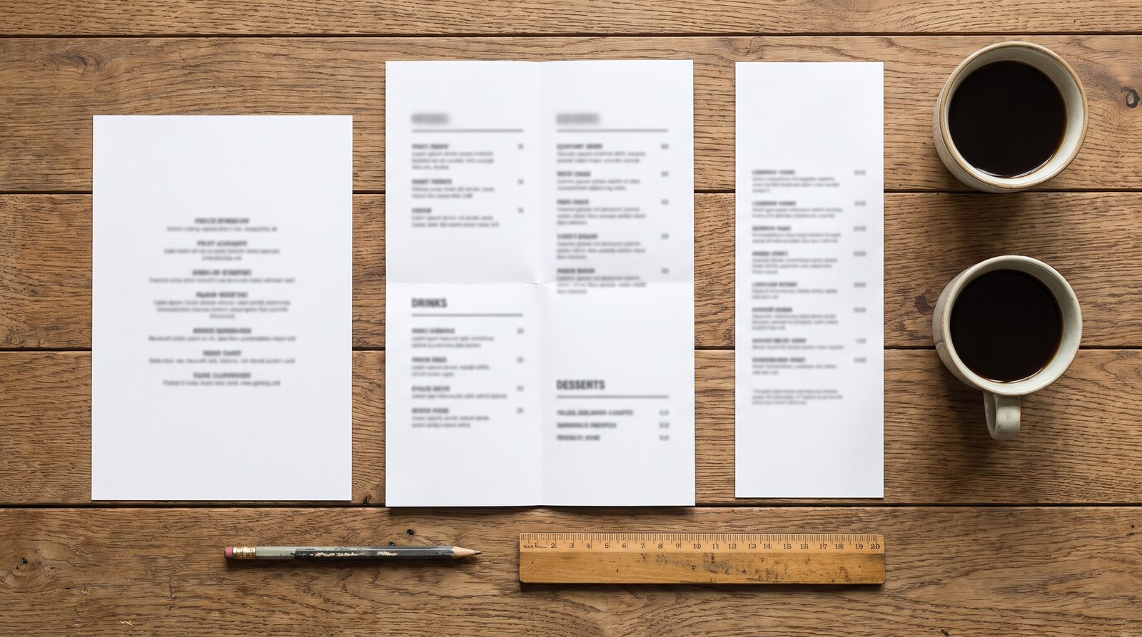
A few layout rules that save most menus:
- One or two typefaces, one for headings and one for dishes. Not five.
- Leave space. A crowded page reads as "cheap" and slows everyone down. If it does not fit, you have too many dishes, not too little paper.
- Keep prices out of a column. More on this below.
- Test it in the real room. Print it, sit at your darkest table at night, and read it without reading glasses. That is your guest's experience.
How many items should be on a menu?
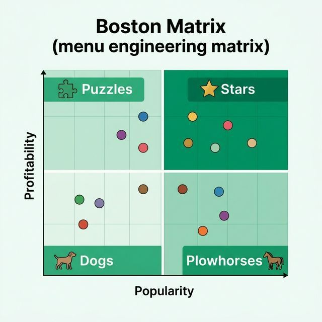
There is no proven ideal number. Keep the dishes that sell and that your kitchen can send out well on your busiest service — and cut the ones that do neither. You'll see figures like "seven per section" quoted as rules; none comes from published research.
The test that works is your own sales:
Illustration · twelve mains, sold per week
Before you add a dish, find the ones nobody orders
- Pull a month of sales per dish from your till.
- Look at the bottom of each section. Which dishes rarely sell and need ingredients nothing else uses?
- Check before cutting. A slow seller that brings in a group (the one vegan main, the kids' favourite, the Sunday roast) earns its place.
- Cut, then watch whether the dishes left behind pick up the orders.
A shorter menu means less stock, less waste, less prep, and quicker decisions for guests. If you are thinking about the profit per dish too, our guide to calculating food cost and GP shows how.
How do I write menu descriptions that sell?
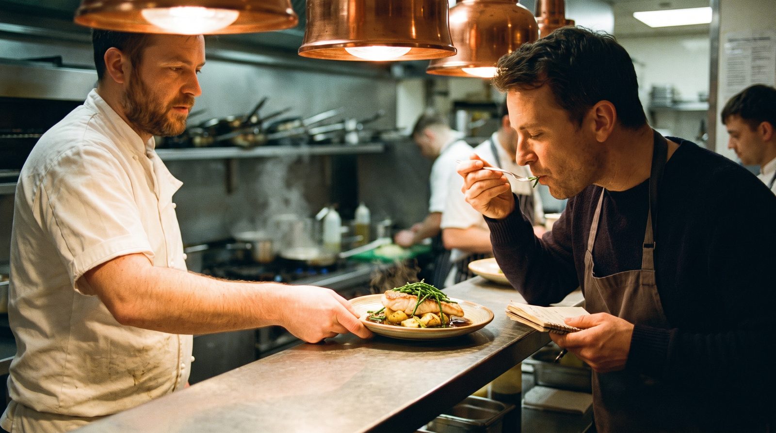
Answer three questions — what is it, how is it cooked, and what one detail makes it worth ordering — and then stop. Taste the dish before you write about it.
Illustration · one dish, three drafts
A description that sells answers three questions — and stops
1. What it is
Fish of the day18.50
2. + how it’s cooked, what’s with it
Pan-roasted hake, crushed new potatoes, samphire18.50
3. + one true detail worth paying for
Pan-roasted Cornish hake, crushed new potatoes, samphire, brown shrimp butter18.50
| Instead of | Try | What changed |
|---|---|---|
| Fish of the day | Pan-roasted Cornish hake, crushed new potatoes, brown shrimp butter | Named fish, where it's from, how it's cooked |
| Burger | Dry-aged beef burger, smoked Cheddar, burger sauce, brioche bun | The two things that make it yours |
| Soup | Roast tomato & red pepper soup, warm sourdough | Flavour and what comes with it |
| Chocolate cake | Warm chocolate brownie, salted caramel, vanilla ice cream | Warm, and what it's served with |
| Full English | Two eggs, Cumberland sausage, back bacon, black pudding, beans, toast | Exactly what's on the plate — no surprises |
Rules for descriptions:
- Short. One line, two at most. A menu is not a novel.
- Specific, not flowery. "Slow-braised for six hours" says more than "succulent, mouth-watering".
- True. "Cornish", "homemade", "free-range" and "fresh" must be accurate. Describing food falsely, or in a way likely to mislead, is an offence under section 15 of the Food Safety Act 1990.
- Consistent. Don't describe some dishes and leave others bare — the bare ones look like an afterthought.
Should prices have a £ sign, or line up on the right?
Neither has to. A column of prices lined up on the right invites guests to shop by price; setting the price after the description keeps the eye on the dish.
Illustration · the same three mains, set two ways
A column of prices invites shopping by price
Prices in a column
Braised beef shin·······························£19.50
mash, roasted roots, red wine gravy
Beer-battered haddock·······························£16.95
chips, crushed peas, tartare
Wild mushroom risotto·······························£15.50
aged parmesan, truffle oil
Price after the description
Braised beef shin
mash, roasted roots, red wine gravy 19.50
Beer-battered haddock
chips, crushed peas, tartare 16.95
Wild mushroom risotto
aged parmesan, truffle oil 15.50
Common practice on well-designed menus:
- Put the price at the end of the description, in the same type size, rather than in a right-hand column with dots leading to it.
- Drop the £ sign on a printed menu. A Cornell study found diners spent more when prices were shown as plain numbers — one restaurant, so worth testing, not a guarantee. Our menu pricing guide covers that study and how to set the prices themselves.
- Be consistent. Pick one style — "16.50" or "16.5" — and use it on every line.
Should my menu have photos?
On a counter, a board or a delivery app, yes — if they are real, well lit and of your own food. On a printed sit-down menu, usually one or two at most, or none.
- Photos help when guests can't see the food any other way: delivery apps, takeaway leaflets, counter menus where people decide fast.
- Photos hurt when they look like stock images, or when the dish that arrives doesn't match. A bad photo sells less than no photo.
- On a restaurant menu, good descriptions do the work. Save the photography for your website and social media.
How do I design a café menu or menu board?
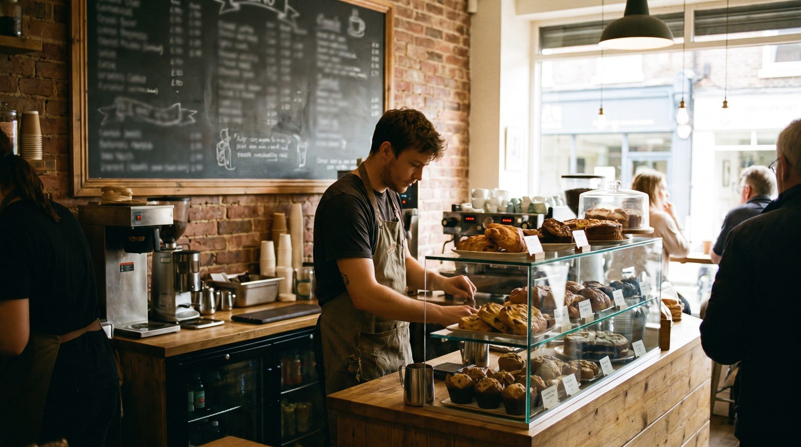
Design the board for someone standing in your queue. Most café customers choose in the few seconds before they reach the till.
- Coffee first, top left, because it is what most people come in for — then food, then the extras.
- Readable from the back of the queue. Fewer words, bigger letters. If people step forward to squint, there is too much on it.
- Group the extras in one line: "Oat, soya or coconut +40p · Extra shot +60p · Syrup +50p".
- Put the food itself at eye level by the till. The display case is part of the menu.
- Keep the table card and the board the same. Two versions with different prices is a complaint waiting to happen.
For pubs, keep a short bar-snacks list where drinkers can see it, and put the weekly favourite — roast, pie night, curry night — on the board with the day it runs. Our guide to increasing café and restaurant sales has more on selling food with drinks.
What must a UK menu legally show?
Prices including VAT, any extra charges as clearly as the prices, allergen information, and — for large businesses in England — calories. Descriptions must be true.
| What | The rule | Applies to |
|---|---|---|
| Prices include VAT | Price Marking (Food and Drink Services) Order 2003 | Everyone selling food and drink |
| Prices visible before people come in | Same Order: for eating in, at or near the entrance to the eating area | Restaurants, cafés and pubs serving food to eat in |
| Service, cover and minimum charges shown as clearly as prices | Same Order; since April 2025, mandatory charges must be in the headline price (Digital Markets, Competition and Consumers Act 2024) | Anyone adding a charge |
| Allergen information for the 14 allergens | Food Information Regulations 2014; the FSA's best-practice guidance favours written information | Every food business — see our allergen compliance guide |
| Calories (kcal) per portion, plus "Adults need around 2,000 kcal a day" | Calorie Labelling (Out of Home Sector) (England) Regulations 2021 | Businesses in England with 250 or more employees |
| Descriptions that don't mislead | Food Safety Act 1990, section 15 | Everyone |
This is a summary, not legal advice. If you are unsure whether a rule applies to you, your local authority's trading standards or environmental health team can tell you.
What are the most common menu design mistakes?
- Too many dishes. The most common problem, and the hardest to see from inside the kitchen.
- Dishes with no description next to dishes with three lines each.
- Prices in a column with dots, so the page reads as a price list.
- Add-ons that aren't printed. If guests don't know they can add chips or oat milk, most never ask.
- Five fonts, clip art and every dish in bold — when everything is highlighted, nothing is.
- Out-of-date menus in use. Crossed-out prices, stickers over dishes, and a board that says something different from the table card.
- Missing legal lines — the allergen statement, or a service charge that only appears on the bill.
- Designing for looks rather than reading. Dark text on dark paper, script fonts for dish names, tiny type to fit everything in.
How do I redesign my menu without upsetting regulars?
Keep your best sellers, change the layout before the dishes, and change one thing at a time. Regulars mind losing a favourite far more than they mind a new look.
- Start with what is already there: reorder the sections, put the right dish first, add descriptions and printed add-ons. None of that takes a dish away.
- Cut slow sellers one section at a time, and tell your team why so they can answer "where's the duck gone?"
- Measure it. Compare average spend per head for the same days of the week before and after — the one-week test shows how.
Check your menu before you print it
It is hard to see your own menu clearly — you know what every line means. That is what we built MenuMargin for. Upload a photo or PDF of your menu for a free audit: it flags dishes with no description, prices bunched too close together and dishes worth setting apart, then shows your top fixes. After a full audit, you can put the menu straight into one of our menu templates.
This guide draws on the operations work behind Epicurean Digital Consultants, the hospitality consultancy I founded after more than 20 years running food and drink businesses.
Sources
- Yang, S. S. (2012). Eye movements on restaurant menus: A revisitation on gaze motion and consumer scanpaths. International Journal of Hospitality Management, 31(4), 1021–1029.
- Yang, S. S., Kimes, S. E. and Sessarego, M. M. (2009). $ or Dollars: Effects of Menu-price Formats on Restaurant Checks. Cornell Hospitality Report, 9(8).
- The Price Marking (Food and Drink Services) Order 2003, legislation.gov.uk.
- The Calorie Labelling (Out of Home Sector) (England) Regulations 2021, legislation.gov.uk.
- Food Safety Act 1990, section 15: Falsely describing or presenting food, legislation.gov.uk.